Some of the SCRIBD documents used for the evaluations are not displaying the work properly on Blogger. If this be the case, please click on the link at the beginning of each Scribd document to see what is written in full.
Also, some of the SCRIBD documents cannot be viewed on Apple Macs for some reason. If this be the case they can be viewed on regular PC's.

Friday, 18 March 2011
Wednesday, 16 February 2011
Evaluation- Question Four
How did you use media technologies in the construction and research, planning and evaluation stages?
.
Numerous software's and equipment were needed in order for this project to be completed; you wouldn't even know where to start without it.
.
First things first, technology came into direct contact right at the beginning of the project when we had to create our A2 media blogs. The software BLOGGER, the same as in the AS year was the chosen software to publish our coursework on. Blogger is an essential component in this project not only for displaying our work effectively, but also providing a way of communication, managing our time and obtaining feedback. This interactive blog also enabled us to post research videos from YOU TUBE as well as allowing us to publish Slide-share publications and Vimeo videos, displaying our ideas, planning, research and of course our final work.
.
 .
.The search engine FIREFOX acted basically as the hub for this entire project. In order for us to research, access our blogs and review other work, the internet was essential. This in turn leads on to how we began to research. After discovering our chosen music genre, we needed to research into the music video conventions. In order to do this, the broadcasting site YOU TUBE was used predominately in order for us to watch and analyse numerous music videos.
These two pieces of software provided us with existing music videos in abundance as well as helping us to understand the conventions of these products. This ensured that we were able to create a realistic and professional; product which complied with the industry’s conventions. It was in fact the internet that lead us to finding the music genre that best related to our chosen song. The website UK TRIBES was used in order for us to obtain in depth information about our target audience as well as an insight into their interests and hobbies. Without the internet, such accurate information as this would have been hard to come by.
.

The social networking site FACEBOOK, was the chosen software for our group to correspond and discuss ideas out of school as well as obtain a wide range of feedback for all three products, whether rough or finished.

Even though the above can be accessed on nearly all PC's, our work would predominately be created and manipulated on the sophisticated APPLE IMAC. This quality piece of equipment enabled us to construct the aspects of our project effectively and with ease.
.The Ancillary Tasks
In order for us to create distinctive and high quality ancillary tasks, the software ADODE PHOTOSHOP was used. After using the software at AS level, we were able to effectively construct a Digipak and Magazine Advertisement , using all the necessary tools provided by the software. The magazine advertisement consisted of a basic image of our artist looking in an upward direction. This image was heavily manipulated in photoshop using such techniques as desaturation and the stamp tool in order to achieve the desired effect. Again, for the Digipak such tools as the magic wand and adjusting the opacity levels were used to create the basic firework template. The coloured firework impression was also manipulated via the hue/ saturation tool and changing opacity levels. (For more detailed information please see the development stages).
The Music Video
We used a Sony DCR-HC62 camera to film our video. The high quality camera enabled us to achieve the crisp look we wanted and needed for our video to look professional. The settings on the camera also enabled us to manipulate such aspects as lighting in order to achieve the desired effect. An example of this was in the opening section of our music video. The spotlight setting was used in order to illuminate the artists face, but not the surroundings. For some of our footage, we used a tripod. This allowed us to obtain stable footage for desired sections of the video. Predominately, however we used it hand-held. As our artist was constantly on the move throughout the video, the camera movement worked well with the walking sequences.
.Our footage was then uploaded to the programme FINAL CUT. Our audio was first manipulated on the highly advanced garage band. It was then imported into the Final Cut software's timeline, before capturing our desired footage and, over time, placing sections of footage into place. The took a lot of time as some aspects such as lip syncing and narrative features and to be shown at chosen parts in the lyrics. The software enabled us to constantly view each section of footage, which if needing to be modified, was easy to do. The software also enabled us to experiment with different effects for our music video; it being either colour correction or transitions.
Editing the Video Please click on link to view in better detail.
When out filming, images were taken on an IPHONE 4 of our group working, locations and of our artist performing. This provided us with crisp images to work with and use as evidence, showing our group working effectively. These images could then easily be uploaded to the desired software in JPEG form.
.Technology has been vital when presenting and assessing our work in the evaluation stages. Technology has been used throughout as well as answering these evaluation questions efficiently. Video's have been created, provided final feedback on all three components of this project. Compilations have also been created in order to elaborate on the text based answers. Such features as these make the evaluation much more engaging for the viewers as well as express our work in a more effective manner. Without all this technology, this project could not be done!!!
Evaluation- Question Two
How effective is the combination of your main product and ancillary texts?
As well as having to complete a music video for this project, two ancillary tasks needed to be created also. As our group had experience using manipulation software, we chose to create a Digipak and Magazine advertisement to accompany the main task. Throughout our research during this project, we have discovered that most artists usually carry a house style for the majority of their products for promotional purposes. Therefore, extensive research was undertaken into how house styling is maintained. Such aspects as unique logo’s and fonts enable some artists to be easily identified by their target audience.
 We tried to portray this feeling of a house style through out our ancillary tasks.
- As you can see, aspects of the house style are maintained via the constant use of the font 'Roadway' for all text on each of the ancillary tasks. Even though colours have been changed, the style of the font can easily be recognised as being the same.
- The image used for the magazine advertisement is the same as the one on the inside left cover of the Digipak. This was done to maintain the continuity of the two products.
- Other corresponding factors between the magazine ad. and components of the Digipak are the use of the record labels logo on each piece as well as some similarities in colour with the interior.
- The disc directly relates to the interior of the Digipak; the colours used as well as the worn/ Burn't effect. This aspect can in turn relate to the 'Fire' in the title of the song as well as the burning picture sequence at the end of the music video.In Greater Depth
Our genre being 'RnB/Hip-Hop' was enormously beneficial as all our group members listened to this type of music and had ideas in abundance as to how to go about the ancillary tasks. As our song expresses a lot of emotion throughout, we wanted to make our ancillary tasks as expressive as possible also. In order to do this we concentrated on amplifying each individual aspect rather then putting over elaborative detail into it. We followed this representation for both platforms.
Once all aspects of the ancillary tasks were completed, we were given feedback by those willing (see question three) who expressed their opinions on our finished work. The majority of the feedback we received was very positive. The audience could easily identify the house style of the piece as well as falling into our music genre category.
Evaluation- Question One
Evaluation Question 1
Part 2
Part 2
NOTE: IF ANY OF THE ABOVE PAGES SHOW BLANK, PLEASE FOLLOW THE EVALUATION LINK AT THE BEGINNING OF THE POST TO VIEW THE CONTENTS IN FULL.
Has been noted that some slides come out blank when viewing :(
Has been noted that some slides come out blank when viewing :(
Saturday, 12 February 2011
Tuesday, 8 February 2011


Monday, 7 February 2011
Music Video 'add-on' Features
When watching Muisc video's on the television, there is normally a reference via name or image of the actual channel. Taking this into account we believe our genre of music would be a broadcasting choice for the music channel 'VIVA'. Therefore, like other music video's shown on this channel we will have the 'VIVA' logo positioned in the top left corner for the duration of the song. Another idea we had was a music channel 'FLASHBAR'. These are common on many music channels, normally containing such information as the album name and artist. We decided to create a basic version of this pop up (shown below) which we intend to show at the music video's beginning and end to give it that more professional look.
.
Music Channel FlashBar:
.

.click to enlarge
The vibrant greens and pinks used in this FlashBar were chosen deliberately in order to contrast with the colours of our video. This enables the viewer to easily recognise it when it appears during the video.
Final Magazine Advertisement Production
In our research we looked in depth at a variety of Magazine Advertisements. Our initial design idea for our ad. was agreed (as a group) a great interpretation which will relate to our target audience. We wanted a really simplistic design, using an obvious stamp-like style to make the foundations of our ad. Below is a quick insight into the stages we under went in order to create our Magazine ad:
. 
STAGE ONE- To begin with we began planning simplistic concepts on paper. It was myself who done most of the drawing. The sketch above shows the final template we came up with for our ad design. We wanted to maintain the continuity with the Digipak, by using the same font as well as the image of Remi. We planned for this image to give the impression that our artist is standing in front of a poster/ billboard displaying the text.
STAGE ONE- To begin with we began planning simplistic concepts on paper. It was myself who done most of the drawing. The sketch above shows the final template we came up with for our ad design. We wanted to maintain the continuity with the Digipak, by using the same font as well as the image of Remi. We planned for this image to give the impression that our artist is standing in front of a poster/ billboard displaying the text.
STAGE TWO- We now had to construct this idea on Photoshop. We began by creating a blank A4 canvas as this would be the actual size of the magazine advert. We then incorporated the black strips which would act as a contrasting background for some of the text. Again, using the 'ROADWAY', we wrote the conventional information into each of the corresponding locations. This then gave us our basic backdrop for the magazine advert; nothing complex, but providing us with an bold/ impressive template.
STAGE THREE- In order to get the image of Remi to maintain the theme of the poster, we had to transfigure the image into black and white format. The image was then manipulated via the stamp tool which turned the darker aspects of the picture black, and the lighter parts white. This effect directly corresponded with the other aspects and maintained the continuity of the piece.
STAGE FOUR- The next stage was to add information which directly related to the song and was a conventional aspect of magazine advertisements. We simply added the the star rating and music company logos into the planned area of the piece. These were then turned to black by the fill tool. Again, using Roadway, the sale information was typed in white to make up the ads footer.
STAGE FIVE- In order to maintain the continuity with the DigiPak and video, we had to tranfigure the advertisement in order to give it that worn/ burnt effect. A simple diagonal orange fade colour overlay was created to go on top of the advertisement before the opacity levels were adjusted, just leaving behind the slightest colour disfiguration.

In more Detail- Magazine Production
Using a blank A4 canvas, I simply used the rectangle shape tool to create black rectangles on the white background by dragging the mouse from the point where I wanted the shape to start to the point I wanted it to end.

These stripes would each play host to a line of text on our poster.
These stripes would each play host to a line of text on our poster.

Next I added the text using the horizontal type tool.

The font used was our house style font 'Roadway'. I used the free transform tool to place the text where I wanted it by pressing ctrl+T. I then changed the colour of each line of text so that it would be the opposite to the colour of the stripe it was on. Do do this I just highlighted the text and clicked the colour box so that I could choose a new colour, then clicked OK. These steps produced the following:

Next we had to add a picture of Remi, the artist featured in our video. First we had to chose from some images taken on an iphone 4. Here are some of the images we had to chose from:


The top image is the one we chose to go on our poster. Before it was ready however, we had to import it into Photoshop and then cut it away from the background using the polygonal lasso tool.

I then deleted the background of the photo and dragged the layer containing Remi onto our poster image, resized it using the free transform tool and placed it where I wanted it. However to fit the style of the poster, we had to edit the image. By clicking filter>sketch>stamp, we applied the stamp effect to remi's image. This gave us the following:

Finally, as with the CD cover, we applied an orange gradient using the gradient tool after importing a the logo for our record label and a 4-star rating from google images into our picture and placing them where we wanted. We also added the websites such as that of our label as well as logos fitting to our work. This produced the final product - shown below:


Finally, as with the CD cover, we applied an orange gradient using the gradient tool after importing a the logo for our record label and a 4-star rating from google images into our picture and placing them where we wanted. We also added the websites such as that of our label as well as logos fitting to our work. This produced the final product - shown below:

Sunday, 6 February 2011
Final DigiPak Production
As a group we looked in a lot of detail at the first DigiPak produced and decided that the design was much to busy. We was as trying to link this design with our ideas for the magazine advertisement style and decided that the two components would not link together effectively.
.
Our third attempt at the DigiPak, which proved to be our final design learnt towards a very simplistic design style. This design was deliberately put together in a much more basic design, having no image of the artist at all (similar to some of Kanye West's covers). Instead, basic fireworks made up the foundations for this simple but effective design. Below are the stages of production.
 We then created our background layer, using fill tool on the document we created to make it black.
 We now have our canvas. The next stage required us to find images of fireworks that we could then manipulate into looking like the clip art styled images we need.
We found a suitable image of a firework through searches on google. We then imported the said image into photoshop. First we desaturated it to make it black and white by clicking Image>Adjustments>Hugh/Saturation... We than applied the following settings:

Now the image had become black and white, we had to apply an effect that would give it the clip art like appearance. We chose the stamp effect by clicking Filter>Sketch>Stamp... We then applied the following settings:
 Now we had the fireworks in place, it was time to add the text. We searched dafont.com for a suitable font and we discovered on named 'Roadway', we imported this font into photoshop and, following the rough layout of our plan, added the text to the image using the Horizontal type tool tool.
We then changed the colours of the text. To a pale orange and a very slightly orange tinted white. We also placed the text and changed its size by clicking Edit>Transform>Free Transform. Here is the result.

We then added a gradient to give an orange theme to the front cover. The gradient was added with the gradient tool on the sidebar and the following settings:
 We also added the compulsory parental advisory logo into the bottom corner and here is the result:
  The bulk of the work is now done, but we still need to add the effects that will give a professional look to our cover. First of all, I wanted to give the cover some paper texture so that it carried a similar style to the poster and our disc, which are all paper themed. I found that many of the photoshop effects available to me were not good enough as they were too neat and structured in their design, so i decided to find an image of paper texture through google. This is what I chose:
 Once placed in the document, this image obviously needed some editing before it gave the desired effect. First we had to set the blending mode to overlay in the layer pallet so that the image would blend in with our cover. However this was to strong so the opacity had to be changed, these are the setting given to the layer:


Once placed into the cover image, these layers were both given the blend mode of overlay and each had their opacity changed to levels that suited us. Once we were happy with the result, we re-added the parental advisory logo and we were finished. Here is the end result: 


SPINE
Creation of the spine was quick and easy. The spine is 0.8 inches wide and 12 inches in length. As with the front cover and the back cover, we followed a number of stages.
-background of spine set to black
-Roadway font, Horizontal Type Tool and Free Transform used to make the text span the entire spine as seen on many covers we researched.
- Text set to the same pale orange and orange tinted white colours as used in the front cover stages.
-Young Money record label logo imported from google and placed at the top of spine, as seen on other young money CDs.
-Finally, a firework image added on a layer over everything. The blend mode is set to overlay and opacity is changed, as before.
Here is the final result:

Disc Production
The stages of creation for our disc, from importing a blank CD template into photoshop to this the image below, were exactly the same as seen on the creation of the magazines poster. As they were produced using exactly the same methods and tools. However the disc has one further stage that was not on the poster.

We wanted to add a burnt effect to the disc to link into our video's style. To make the image look like it could burn, we overlayed the below image of paper texture:

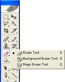
Then, we used the eraser tool to rub out parts of the cd, and these bits would be the bits that had been burned away.
Next, I used the paint brush tool to paint the edges of the burn area a darker brown, and then used an innerglow by clicking layer>layer style>innerglow. This effect would be made dark and would make the rubbed out edges look as if they had been burned. This prodiced the final result below:


We wanted to add a burnt effect to the disc to link into our video's style. To make the image look like it could burn, we overlayed the below image of paper texture:

Then, we used the eraser tool to rub out parts of the cd, and these bits would be the bits that had been burned away.
Next, I used the paint brush tool to paint the edges of the burn area a darker brown, and then used an innerglow by clicking layer>layer style>innerglow. This effect would be made dark and would make the rubbed out edges look as if they had been burned. This prodiced the final result below:

Subscribe to:
Comments (Atom)